


Unsupervised Learning is a general term that incorporates a large set of statistical tools, used to perform data exploration, such as clustering analysis, dimensionality reduction, visualization, and outlier detection. Such tools are particularly important in scientific research, since they can be used to make new discoveries or extract new knowledge from the dataset. For example, a cluster analysis that reveals two distinct clusters of planets might suggest that the two populations are formed through different formation channels, or, a successful embedding of a complex high-dimensional dataset onto two dimensions might suggest that the observed complexity can be attributed to a small number of physical parameters (e.g., the large variety of stellar spectra can be attributed to a single sequence in temperature, stellar mass, and luminosity; e.g., Hertzsprung 1909 and Russell 1914). While visual inspection of the dataset can achieve these goals, it is usually limited to 3–12 dimensions (see lecture 2 by S. G. Djorgovski). Visual inspection becomes impractical with modern astronomical surveys, which provide hundreds to thousands of features per object. It is therefore necessary to use statistical tools for this task.
Unsupervised Learning algorithms take as an input only the measured features, without labels, and as such, they cannot be trained with some "ground truth". Their output is typically a non-linear and non-invertible transformation of the input dataset, consisting of an association of different objects to different clusters, low-dimensional representation of the objects in the sample, or a list of peculiar objects. Such algorithms consist of internal choices and a cost function, which does not necessarily coincide with our scientific motivation. For example, although K-means algorithm is often used to perform clustering analysis (see section 3.2.1), it is not optimized to detect clusters, and it will reach a correct global optimum even if the dataset is not composed of clusters. In addition, these algorithms often have several external free parameters, which cannot be optimized through the algorithm’s cost function. Different choices of external parameters may result in significantly different outputs, resulting in different interpretations of the same dataset. The interpretation of the output of an unsupervised learning algorithm must be carried out with extreme caution, taking into account its internal choices and cost function, and the output’s sensitivity to a change of external parameters. However, since unsupervised learning is typically used for exploration, not necessarily to reach a precisely determined goal, the lack of objective to optimize is often not critical. It does make it hard to know when one has really exhausted exploring all possibilities.
The first step in the large majority of unsupervised learning algorithms is distance assignment between the objects in the sample. In most of the cases it is assumed that the measured features occupy a euclidean space, and the distance between the objects in the sample is measured with euclidean metric. This choice might not be appropriate for some astronomical datasets, and using a metric that is more appropriate could improve the algorithm’s performance. For example, when the input dataset consists of features that are extracted from astronomical observations, these features typically do not have the same physical units (e.g., stellar mass, temperature, size and morphology of a galaxy, bolometric luminosity, etc). In such cases, euclidean distance assignment will be dominated by features that are distributed over the largest dynamical range (e.g., black hole mass ∼ 108 M⊙), and will not be sensitive to the other features in the input dataset (e.g., stellar velocity dispersion ∼ 200 km/sec). Therefore, when applying unsupervised machine learning algorithms to a set of derived features, it is advised to rescale the features (see also section 2.2).
When applied to astronomical observations, such as spectra, light-curves, or images, the euclidean distance might not trace the distances a scientist would assign. This is partly since the euclidean metric implicitly assumes that all the features are equally important, which is not necessarily the case. Figure 7 shows two examples of such scenarios. The left panel shows spectra of three galaxies, marked by A, B, and C, and the right panel shows three synthetic light-curves. In the galaxy case, galaxy A appears different, since it shows a strong emission line. Thus, we would expect that the distance between galaxy A and B will be larger than the distance between galaxy B and C. However, most of the pixels in a galaxy spectrum are continuum pixels, and the continuum of galaxy B is slightly bluer than the continuum of galaxy C. Since the spectra are dominated by continuum pixels, the euclidean distance between galaxy B and C will be larger than the distance to galaxy A. That is, using a euclidean metric, galaxy B is different. Similarly in the light-curve case, since the euclidean metric is sensitive to horizontal shifts, the distance between light-curve B and C will be larger than the distance between light-curve A and C. In many scientific applications, we want to define a metric in which A stands out. Such metrics can be based on domain knowledge, where e.g., the metric is invariant to shifts, rotations, and flips, or they can be based on some measure of feature importance, e.g., emission line pixels being more important than continuum pixels.
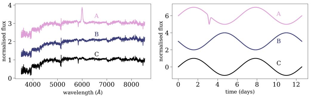 |
Figure 7. Illustration of the disadvantages in using the Euclidean metric to measure distances between astronomical observations. The left panel shows three galaxy spectra, marked by A, B, C, where galaxy A appears visually different. However, the Euclidean distance between galaxy B and C is larger than the distance between galaxy A and B, since most of the pixels in a galaxy spectrum are continuum pixels, and galaxy B is slightly bluer than galaxy C. The right panel shows three synthetic light-curves. Since the Euclidean metric is not invariant to horizontal shifts, the distance between light-curve B and C is larger than the distance to light-curve A, although the latter appears visually different. |
There are several distance measures which can be more appropriate for astronomical datasets and may result in improved performance, such as cross correlation-based distance (see e.g., Protopapas et al. 2006; Nun et al. 2016; Reis et al. 2018b), Distance Correlation, Dynamic Time Warp, Canberra Distance, and distance measures that are based on supervised learning algorithms (see Reis et al. 2018b for details). Section 3.1.1 describes a general distance measure that is based on the Random Forest algorithm, and was shown to work particularly well on astronomical spectra. Since the Random Forest ranks features according to their importance, the Random Forest-based distance is heavily influenced by important features, and is less affected by irrelevant features.
3.1.1. General Similarity Measure with Random Forest
So far, the discussion on Random Forest (section 2.4) was focused on a supervised setting, where the model is trained to perform classification and regression. However, Random Forest can be used in an unsupervised setting, to estimate the distance between every pair of objects in the sample. Shi & Horvath (2006) presented such a method, and Baron & Poznanski (2017), followed by Reis et al. (2018a) and Reis et al. (2018b), applied the method to astronomical datasets, with a few modifications that made the algorithm more suitable for such datasets.
In an unsupervised setting, the dataset consists only of measured features, without labels, and is represented by an N × M matrix, where every row represents an object (N objects in the sample), and every column represents a feature (M measured features per object). To translate the problem into a supervised learning problem that can be addressed with Random Forest, a synthetic dataset is built. The synthetic dataset is represented by a N × M matrix, similarly to the original dataset, where each feature (column) in the synthetic data is built by sampling from the marginal distribution of the same feature in the original dataset. One can, instead, shuffle the values in every column of the original data matrix, resulting in a similar synthetic data matrix. The process of creating the synthetic data is illustrated in figure 8 with a simplified example taken from Baron & Poznanski (2017), where the objects in the dataset have only two features. The left panel shows the original dataset, with the marginal distributions in each of the features plotted on the top and on the right. The right panel shows the synthetic dataset, where the features show the same marginal distribution as in the original dataset, but stripped of the covariance seen in the original dataset.
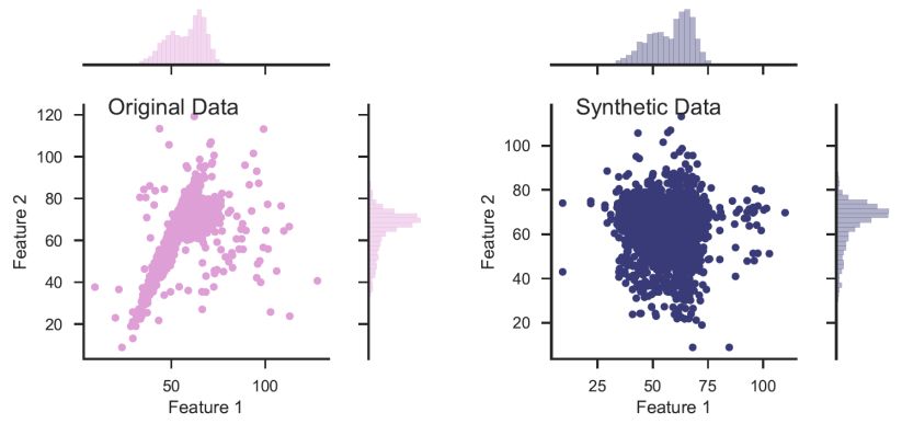 |
Figure 8. Illustration of synthetic data construction, taken from Baron & Poznanski (2017), in a simplified example of a dataset with only two features. The left panel shows the distribution of the features of the original dataset, and their marginal distributions. The synthetic dataset (right panel) is constructed by sampling from the marginal distribution of each feature in the original dataset. The resulting dataset shows the same marginal distribution in its features, but is stripped of the covariance that was present in the original dataset. |
Once the synthetic dataset is constructed, the original dataset is labeled as class 1 and the synthetic dataset is labeled as class 2, and Random Forest is trained to distinguish between the two classes. During this training phase, the Random Forest is trained to detect covariance, since it is present only in the original dataset and not in the synthetic one. As a result, the most important features in the decision trees will be features that show correlations with others. Having the trained forest, the distance between different objects (in the original dataset) is defined as follows. Every pair of objects is propagated through all the decision trees in the forest, and their similarity is defined as the number of times they were both classified as class 1, and reached the same terminal leaf. This similarity S can range between 0 to the number of trees in our forest. S is a measure of the similarity between these two objects since objects that have a similar path inside the decision tree have similar features, and as a consequence are represented by the same model (for more details see Baron & Poznanski 2017).
Baron & Poznanski (2017), Reis et al. (2018a), and Reis et al. (2018b) showed that this definition of similarity between objects traces valuable information about their different physical properties. Specifically, they showed that such metric works particularly well for spectra, and traces information coming from different emission and absorption lines, and their connection to the continuum emission. Reis et al. (2018a) applied this method to infrared spectra of stars, and showed that this metric traces physical properties of the stars, such as metallicity, temperature, and surface gravity. The algorithm was implemented in python and is publicly available on github 9.
Clustering analysis, or clustering, is the task of grouping objects in the sample, such that objects in the same group, which is called a cluster, are more similar to each other than to objects in other groups. The definition of a cluster changes from one algorithm to the next, and this section describes centroid-based clustering (K-means; section 3.2.1) and connectivity-based clustering (Hierarchical clustering; section 3.2.2). Also popular is distribution-based clustering, with the prominent method being Gaussian Mixture Models, which I do not discuss in this document (see e.g., de Souza et al. 2017 and references within). Throughout this section, I give examples with a simplified dataset that consists of two features. Obviously, a two-dimensional dataset can be visualized and clusters can be detected manually, however, these algorithms can be used to search for clusters in complex high-dimensional datasets.
One of the most widely used clustering methods is K-means, which is a centroid-based clustering algorithm (e.g., MacQueen 1967). K-means is simple and robust, even when performing clustering analysis in a high-dimensional space. It was used in Astronomy in various contexts, to study stellar and galaxy spectra, X-ray spectra, solar polarization spectra, spectra from asteroids, and more (see e.g., Balazs et al. 1996; Hojnacki et al. 2007; Galluccio et al. 2008; Sánchez Almeida et al. 2010; Simpson et al. 2012; Sánchez Almeida & Allende Prieto 2013; Garcia-Dias et al. 2018 and references therein).
The first step of K-means is distance assignment between the objects in the sample. The default distance is the euclidean metric, but other metrics, which are more appropriate for the particular dataset at hand, can be used. Then, the algorithm selects k random objects from the dataset which serve as the initial centroids, where k is an external free parameter. Each object in the dataset is then assigned to its closest of the k centroids. Then, new cluster centroids are computed by taking the average position of the objects that are associated with the given cluster. These two steps, re-assigning objects to a cluster according to their distance from the centroid and recomputing the cluster centroids, are repeated iteratively until reaching convergence. Convergence can be defined in several manners, for example, when the large majority of the objects are no longer reassigned to different centroids (90% and more), or when the cluster centroids converge to a set location. The output of the algorithm consists of the cluster centroids, and an association of the different objects to the different clusters. K-means is available in the scikit-learn library 10.
Panel (A) in Figure 9 shows an application of K-means to a two-dimensional dataset, setting k = 2 and using euclidean distances, where the dots represent the objects in the sample, triangles represent the cluster centroids, and different colors represent different clusters. As noted in the previous paragraph, K-means starts by randomly selecting k objects as the initial cluster centroids. In some cases, different random assignments of initial centroids might result in different outputs, particularly when K-means converges to a local minimum. To avoid it, one can run K-means several times, each time with different randomly-selected centroids, and select the output that results in the minimum sum of squared distances between the objects and their centroids. Panel (B) in Figure 9 shows an application of K-means to a similar dataset, but with k = 3. k is an example of an external parameter that cannot be optimized with the cost function, since the cost function decreases monotonically with k. Obviously, setting k to be equal to the number of objects in the sample will result in the minimum possible cost of zero, since each object will be defined as its own cluster. Finding the best k is not trivial in most of the cases, and studies either use the elbow method, or define probability-based scores to constrain it (see e.g., Sánchez Almeida et al. 2010). In some cases, the distribution of the distances of all the objects in the sample contains several distinguishable peaks, and can guide the selection of the correct k.
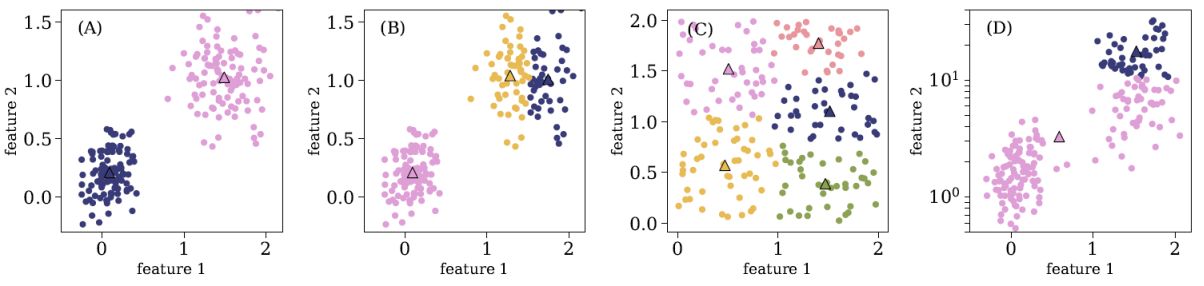 |
Figure 9. Four examples of K-means application to different two-dimensional datasets, where the objects in the sample are marked with circles and the clusters centroids are marked with triangles. The different colors represent different clusters. Panel (A) shows K-means application with k = 2 and a euclidean distance. Panel (B) shows K-means application to a similar dataset, but with k = 3. Panel (C) shows K-means output for a dataset without clear clusters, and panel (D) shows the result for a dataset with features which are distributed over different dynamical scales. |
Panel (C) in Figure 9 shows an application of K-means to a dataset with no clear clusters. This is an example in which the output consists of clusters while the dataset does not show clear clusters. To test for such cases, one can compare the distribution of distances between objects within the same cluster to the typical distance between cluster centroids. In this particular example, these are roughly similar, suggesting that there are no clear clusters in the dataset. Panel (D) shows an application of K-means to a dataset with features that are distributed over different dynamical scales, and one can see that K-means failed in finding the correct clusters. The K-means cost function is based on the summed distances between the objects and their centroids, and since the distances between the objects are much larger in feature 2 (y-axis), the optimal output is completely dominated by its values. To avoid such issues, it is recommended to either normalize the features, or rank-order them before applying K-means. K-means will also fail when the dataset contains outliers, since they can have a significant impact on the centroids placements, and therefore on the resulting clusters. Thus, outliers should be removed before applying K-means to the dataset.
3.2.2. Hierarchical Clustering
Hierarchical clustering is another popular algorithm in cluster analysis, aiming at building a hierarchy of clusters (e.g., Ward 1963). The two main types of Hierarchical clustering are Agglomerative Hierarchical clustering, also named the "bottom-up" approach, where each object starts as an individual cluster and clusters are merged iteratively, and Divisive Hierarchical clustering, or "top-down", where all the objects start in one cluster, then split recursively into smaller clusters. Hierarchical clustering has been applied to various astronomical datasets, such as X-ray spectra, extracted features from galaxy images, and absorption spectra of interstellar gas (see e.g., Hojnacki et al. 2007; Baron et al. 2015; Hocking et al. 2015; Peth et al. 2016; Ma et al. 2018a). The discussion in this section is focused on Agglomerative Hierarchical clustering.
The first step of Hierarchical clustering is also assigning distances between the objects in the sample, using the euclidean metric by default. All the objects in the sample start as one-sized clusters. Then, the algorithm merges the two closest clusters into a single cluster. The process is repeated iteratively, merging the two closest clusters into a single cluster, until the dataset consists of a single cluster, which includes many smaller clusters. To do so, one must define a distance between clusters that contain more than one object, also referred to as "linkage method". There are several different linkage methods, which include "complete linkage", where the distance between the clusters is defined as the maximal distance between the objects in the two clusters, "single linkage", where the distance between the clusters is defined as the minimal distance between the objects in the clusters, "average linkage", where the distance is defined as the average distance between the objects in the clusters, and "ward linkage", which minimizes the variance of the clusters merged. The linkage method is an external free parameter of the algorithm, and it has a significant influence on the output.
The result of Hierarchical clustering is usually visualized with a dendrogram. Figure 10 shows an application of Hierarchical clustering to a dataset with 11 objects, marked by A, B, .., K in the diagram. The dendrogram represents the history of the hierarchal merging process, with the vertical axis showing the distance at which two clusters were merged. Clusters A and B were merged first, since their merging distance is the shortest (up to this point the clusters contain a single object). Then, clusters C and D were merged. Following that, clusters (A, B) and (C, D) were merged, since they were the clusters with the shortest distance. The next two merging clusters are J and K, and the process continues until clusters (A, B, C, D, E, F) and (G, H, I, J, K) are merged into a single cluster. The dendrogram can be used to study the structure of the dataset, in particular, it can be used to infer the number of clusters in the dataset. The example in Figure 10 suggests that the dataset consists of two clusters, (A, B, C, D, E, F) and (G, H, I, J, K), since the merging distance of inter-cluster objects (d1 in the figure) is much shorter than the merging distance of the two final clusters (d2 in the figure). The dashed horizontal line represents the threshold t used in Hierarchical clustering for the final cluster definition. Groups that are formed beneath the threshold t are defined as the final clusters in the dataset, and are the output of the algorithm. t is an external free parameter of the algorithm, and cannot be optimized using the cost function. It has a significant effect on the resulting clusters, in particular, as t decreases, the number of resulting clusters increases. In some cases, the dendrogram can be used to estimate a "natural" threshold value. Agglomerative Hierarchical clustering is available in scikit-learn 11. Visualization of the resulting dendrogram can be done with the scipy library, and is presented in the hands-on tutorials 12.
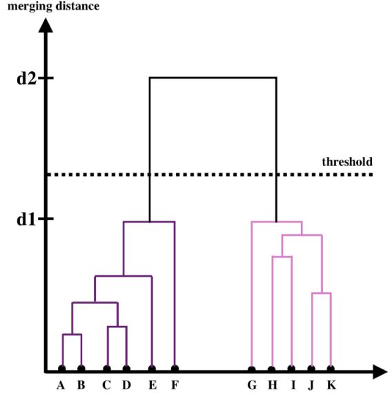 |
Figure 10. Visualization of a dendrogram for a dataset with 11 objects, marked by A, B, .., K. The dendrogram represents the hierarchical merging history, where the y-axis represents the distance at which two clusters were merged. The clusters that merged with a shorter distance were merged earlier in the process, and in this case, the merger history is A and B, C and D, (A,B) and (C,D), J and K, and so on. The dashed horizontal line represents the threshold t that is used to define the final clusters in the dataset (see text for more details). |
Figure 11 shows an example of Hierarchical clustering application to a two-dimensional dataset, using different linkage methods, setting t to be 0.7 of the maximal merging distance. The top panels show the distribution of the objects in the dataset, colored by the final clusters detected by the algorithm, and the bottom panels show the dendrograms for each of the linkage methods. Looking at the first row, one can see that different linkage methods result in different cluster definitions, in particular, both the number of detected clusters and the association of objects to clusters change for different linkage methods. In this particular example, it is clear that the single linkage returns the correct output, however, for high-dimensional datasets such a visualization is not possible. To select the "correct" linkage method for the particular dataset at hand, it is advised to examine the resulting dendrograms. In this specific case, the second row shows that the single linkage-based dendrogram reveals the most significant clustering, with two detected clusters. A general rule of thumb to select of the "correct" linkage method is by selecting the linkage that results in the largest difference between the merging distance of the resulting clusters and the final, maximal, merging distance.
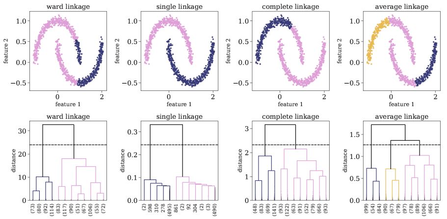 |
Figure 11. Application of Hierarchical clustering to a two-dimensional dataset, using different linkage methods, and setting t to be 0.7 of the maximal merging distance. The top panels show the distribution of the objects in the dataset, colored by the final cluster association. The bottom panels show the resulting dendrograms of each linkage method, and the dashed horizontal line represents the threshold t used to define the final clusters. The dendrograms are truncated for representational purposes, and the number objects in each truncated branch is indicated on the x-axis in parentheses. |
As shown in figure 11, Hierarchical clustering can be used to detect clusters which other clustering algorithms, such as K-means and Gaussian Mixture Models, cannot detect. Since it is based on connectivity, it can be used to detect clusters that are distributed over a non-trivial manifold (this is usually possible only with the single linkage method). Furthermore, Hierarchal clustering is less sensitive to outliers in the dataset, since these will be merged last, and thus will not effect the structure of the dendrogram and the resulting clusters that merged before that. Perhaps the most interesting application of Hierarchical clustering is reordering and visualizing complex distance or correlation matrices. The left panel of Figure 12 shows as example of a correlation matrix, calculated for a complex dataset with 400 objects. The rows and columns of the correlation matrix are ordered according to the object index, and clearly, this representation conveys little information about the structure of the dataset. Instead, one can perform Hierarchical clustering and extract a dendrogram for this particular dataset. Then, one can rearrange the objects in the correlation matrix according to their order of appearance in the dendrogram. The reordered correlation matrix is shown in the right panel of Figure 12, where one can find at least two clusters of objects, such that objects that belong to a given cluster show strong correlations, and objects that belong to different clusters show a strong negative correlation. Therefore, the process described above may reveal rich structures in the dataset, which may allow one to explore and extract information from it, even without performing cluster analysis (see also Souza & Ciardi 2015).
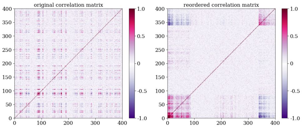 |
Figure 12. Application of Hierarchical clustering to reorder and visualize a complex correlation matrix. The left panel shows a correlation matrix calculated for a dataset with 400 objects, where the colorbar represents the Pearson correlation coefficient between every pair of objects. The rows and columns are ordered according to the object index, and little information can be extracted from such a visualization. The right panel shows the same correlation matrix, reordered according to the appearance order of the objects in the dendrogram. The latter representation reveals interesting structures, and can be used to interpret the dataset. |
3.3. Dimensionality Reduction Algorithms
Dimensionality reduction refers to the process of reducing the number of features in the original dataset, either by selecting a subset of the features that best describe the dataset, or by constructing a new set of features that provide a good description of the dataset. Some of the dimensionality reduction algorithms provide principle components or prototypes, which are a small set of objects that have the same dimensions as the objects in the original dataset, and are used to represent all the objects in the sample. Other algorithms aim at embedding the high-dimensional dataset onto a low-dimensional space, without using principle components or prototypes. When applying dimensionality reduction algorithms to data, we always lose some information. Our goal is to choose an algorithm that retains most of the relevant information, where relevant information strongly depends on our scientific motivation.
Dimensionality reduction is useful for a variety of tasks. In a supervised learning setting, since many algorithms are not capable of managing thousands of features, dimensionality reduction is used to decrease the number of features under consideration, by removing redundancy in the original set of features. Although not very popular in Astronomy, dimensionality reduction is also used for compression, and will become more relevant for surveys such as the SKA (Dewdney et al. 2009), where keeping all the data is no longer possible. Perhaps most importantly, dimensionality reduction can be used to visualize and interpret complex high-dimensional datasets, with the goal of uncovering hidden trends and patterns.
3.3.1. Principle Component Analysis
Principle Component Analysis (PCA) is a linear feature projection, which transforms data in high-dimensional space to a lower-dimensional space, such that the variance of the dataset in the low-dimensional representation is maximized. In practice, PCA constructs a covariance matrix of the dataset and computes its eigenvectors. The eigenvectors that correspond to the largest eigenvalues are used to reconstruct a large fraction of the variance in the original dataset. These eigenvectors, also called principle components, are arranged such that the first principle component has the largest possible variance, and each succeeding component has the highest possible variance, under the constraint that it is orthogonal to the preceding components. The number of principal components is at most the number of features in the dataset. Every object in the sample can be represented by a linear combination of the principle components, where the representation is accurate only when all the principle components are used. When a subset of the principle components is used, the representation is approximate, resulting in a dimensionality reduction. The coefficients of the linear combination of principle components can be used to embed the high-dimensional dataset onto a low-dimensional plane (typically 2 or 3 dimensions). Figure 13 shows an application of PCA to a two-dimensional dataset, where the two principle components are marked with black arrows. One can see that the first principle component is oriented towards the direction with the maximal variance in the data, and the second principle component, which is orthogonal to the first one, describes the remaining variance.
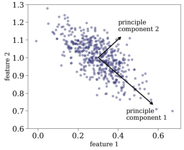 |
Figure 13. Application of PCA to two-dimensional dataset. The two principle components are marked with black arrows, where principle component 1 accounts for most of the variance in the data, and principle component 2, which is orthogonal to principle component 1, accounts for the rest of the variance in the data. Every object in the sample can be accurately represented as a linear combination of the two principle components, and can be represented approximately using the first principle component. |
PCA is among the most popular tools in Astronomy, and it has been used to search for multivariate correlations in high-dimensional datasets, estimate physical parameters of systems from their spectra, decompose complex spectra into a set of principle components which are then used as empirical templates, and more (e.g., Boroson & Green 1992; Djorgovski 1995; Zhang et al. 2006; Vanden Berk et al. 2006; Rogers et al. 2007; Re Fiorentin et al. 2007; Bailey 2012). It is simple to use, has no free parameters, and is easily interpretable. However, PCA performs a linear decomposition of the objects in the sample, which is not appropriate in many contexts. For example, absorption lines and dust extinction are multiplicative effects which cannot be described by a linear decomposition. Furthermore, PCA tends to find linear correlations between variables, even if those are non-linear, and it fails in cases where the mean and the covariance are not enough to define the dataset. Since it constructs its principle components to trace the maximal variance in the data, it is extremely sensitive to outliers, and these should be removed prior to applying PCA. Finally, the principle components of the dataset can contain negative values, which is also not appropriate in many astronomical setups. For example, applying PCA to galaxy spectra results in principle components with negative values, which is of course not physical, since the emission of a galaxy is a sum of positive contributions of different light sources, attenuated by absorbing sources such as dust or gas.
Finally, it is worth noting two additional techniques, Independent Component Analysis (ICA; Hyvärinen & Oja 2000) and Non-Negative Matrix Factorization (NMF; Paatero & Tapper 1994), which are useful for a variety of tasks. ICA is a method used to separate a multivariate signal into additive components, which are assumed to be non-Gaussian and statistically independent from each other. ICA is a very powerful technique, which is often invoked in the context of blind signal separation, such as the "cocktail party problem". NMF decomposes a matrix into the product of two non-negative ones, and is used in Astronomy to decompose observations to non-negative components. Figure 14 shows an application of PCA, ICA, and NMF, taken from Vanderplas et al. (2012), on SDSS spectra (see Ivezic et al. 2014 for additional details about ICA and NMF). The columns represent different algorithms, and the rows represent the resulting components using each of the algorithms, sorted by their importance. One can see that while the first two PCA components resemble galaxy spectra (with an old stellar population), the next three components do not represent a physical component in galaxy spectra, in particular, they show negative flux values. On the other hand, the NMF components resemble more physical components, with the first corresponding to an old stellar population, the second corresponding to blue continuum emission, which might be due to an AGN or O- and B-type stars, the third corresponding to younger stellar population (A-type stars), and the forth and fifth components corresponding to emission lines. Obviously, the resemblance is not perfect and one can see residual emission line components in the first and third components (in the first component these are described by absorption lines with central wavelengths corresponding to the strongest emission lines in galaxy spectra). The three algorithms are available in scikit-learn 13.
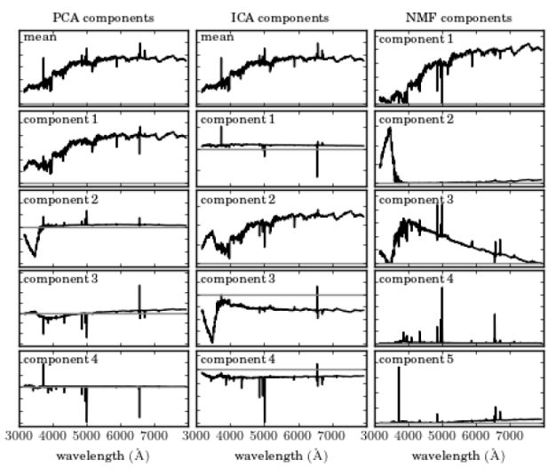 |
Figure 14. Application of PCA, ICA, and NMF to a sample of SDSS spectra, taken from Vanderplas et al. (2012). Additional details on ICA and NMF can be found in Ivezic et al. (2014). The columns represent different algorithms, and the rows represent the resulting components using each of the algorithms, sorted by their importance. The grey horizontal line represents zero flux. While the first two PCA components resemble galaxy spectra (with an old stellar population), the next three components do not represent a physical component in galaxy spectra, in particular, they show negative flux values. On the other hand, the NMF components resemble more physical components, with the first corresponding to an old stellar population, the second corresponding to blue continuum emission, which might be due to an AGN or O- and B-type stars, the third corresponding to younger stellar population (A-type stars), and the forth and fifth components corresponding to emission lines. |
3.3.2. t-Distributed Stochastic Neighbor Embedding
t-Distributed Stochastic Neighbor Embedding (tSNE; van der Maaten & Hinton 2008) is a non-linear dimensionality reduction technique that embeds high-dimensional data in a low dimensional space, typically of two or three dimensions, and is mostly used to visualize complex datasets. The algorithm models every high-dimensional object using a two (or three) dimensional point, such that similar objects are represented by nearby points, whereas dissimilar objects are represented by distant points, with a high probability. tSNE has been used in Astronomy to visualize complex datasets and distance matrices, and study their structure (e.g., Lochner et al. 2016; Anders et al. 2018; Nakoneczny et al. 2018; Reis et al. 2018a; Alibert 2019; , Giles & Walkowicz 2019; Moreno et al. 2019).
The first step of tSNE is to assign distances between the objects in the sample, using the euclidean metric by default. Then, tSNE constructs a probability distribution over pairs of high-dimensional objects such that similar objects have a high probability of being picked, whereas dissimilar objects have an extremely low probability of being picked. This is achieved by modeling the probability distribution using a Gaussian kernel, which depends on the assigned distance between the objects, and a scale parameter, named the perplexity, which is an external free parameter of the algorithm. The perplexity affects the neighborhood of objects being considered, in terms of their probability of being selected, where a small perplexity results in a very small neighborhood around a given object, and a large perplexity results in a larger neighborhood. The algorithm then embeds the high-dimensional objects into a low dimensional space, such that the probability distribution over pairs of points in the low-dimensional plane will be as similar as possible to the probability distribution in the high-dimensional space. The axes in the low-dimensional representation are meaningless and not interpretable. tSNE is available in the scikit-learn library 14.
Figure 15 shows an application of tSNE to a sample of 53 single stellar population models, taken from the MILES library (Vazdekis et al. 2010). The left panel shows 11 out of the 53 spectra, where each spectrum has 4 300 flux values, and therefore 4 300 features, ordered by age. While the dataset appears complex, it actually represents a one-dimensional manifold, where all the observed properties can be attributed to a change in a single parameter, the age. Therefore, we expect that in the low dimensional representation, all the objects will occupy a single line. The right panels show the tSNE two-dimensional embedding for different perplexity values. When the perplexity is set to p = 1, the neighborhoods considered by tSNE are too small, and the data is represented by many small clusters, although the dataset does not consist of clusters. When the perplexity is set to p = 2 or p = 5, the dataset is represented by an almost perfect one-dimensional manifold, tracing the correct structure of the data. When the perplexity is too high, e.g. p = 50, all the points are plotted at the origin, and no structure can be seen. The perplexity has a significant effect on the resulting embedding, and cannot be optimized using the tSNE cost function. It represents the scale of the clusters tSNE is sensitive to, and setting a small perplexity value allows detection of small clusters, while setting a large perplexity value allows study of the global structure of the dataset. However, one must take into account that the low-dimensional embeddings by tSNE sometimes show small clusters, even if these do not exist in the dataset. In addition, one must be careful when trying to interpret long distances in the tSNE map. For example, when p = 2, tSNE embeds the objects considering only neighborhoods of up to about the 6 nearest neighbors around each point, thus, distances smaller than those spanned by this neighborhood are conserved, while longer distances are not. While the distances d1 and d2 appear similar in the tSNE map in Figure 15, the distances between the corresponding objects in the original distance matrix are different by a factor of more than five.
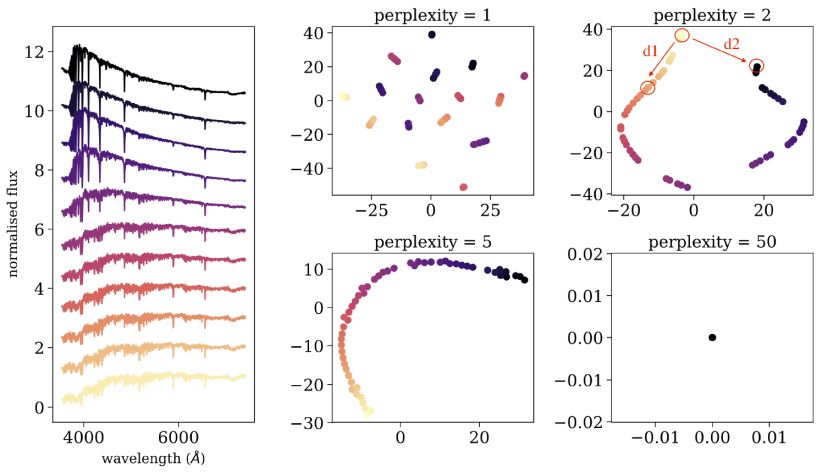 |
Figure 15. Application of tSNE to a sample of 53 synthetic single stellar population models, with different ages. The left panel shows 11 out of the 53 spectra, where each spectrum consist of 4 300 flux values. The right panels show the resulting two-dimensional embedding using different perplexity values, where every point in the 2D plane is colored according to the stellar age, such that purple points represent young stellar populations, and yellow points represent old stellar populations. |
Finally, it is worth noting an additional tool, Uniform Manifold Approximation and Projection (UMAP; McInnes et al. 2018), which can be used to perform non-linear dimensionality reduction. UMAP is a fast algorithm, that supports a wide variety of distance metrics, including non-metric distance functions such as cosine distance and correlation distance. Furthermore, McInnes et al. (2018) show that UMAP often outperforms tSNE at preserving global structures in the input dataset. UMAP is implemented in python and is publicly available on github 15.
An autoencoder is a type of artificial neural network used to learn an efficient low-dimensional representation of the input dataset, and is used for compression, dimensionality reduction, and visualization (Gianniotis et al. 2015; Yang & Li 2015; Gianniotis et al. 2016; Ma et al. 2018b; Schawinski et al. 2018). Figure 16 shows a simplified example of an autoencoder architecture. The network consists of two parts, the encoder and the decoder. In the encoding stage, the input data propagates from the input layers to the hidden layers, which typically have a decreasing number of neurons, until reaching the bottleneck, which is the hidden layer consisting of two neurons. In other words, the encoder performs a compression of the input dataset, by representing it using two dimensions. Then, the decoder reconstructs the input data, using the information from the two-dimensional hidden layer. The weights of the network are optimized during the training, where the loss function is defined as the squared difference between the input data and the reconstructed data. Once trained, the dataset can be represented in a low-dimensional space, also called the latent space, using the values given in the bottleneck hidden layer. As for all neural network-based algorithms, these networks are general and flexible, and can be used to represent very complex datasets. However, this complexity comes with a price. Such networks can have many different architectures, and thus a large number of free parameters, and are difficult to interpret (see lectures by M. Huertas-Company for additional details).
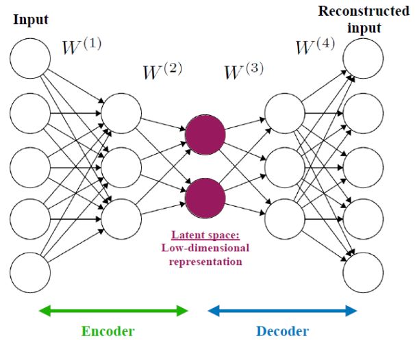 |
Figure 16. A simplified example of an autoencoder architecture, used to perform compression, dimensionality reduction, and visualization. The network consists of two parts, the encoder and the decoder. The encoder reduces the dimensions of the input data, while the decoder reconstructs the input using the low-dimensional representation. The weights of the network are optimized during training to minimize the squared differences between the input and its reconstruction. The bottleneck of the network, also called the latent vector or latent space, represents the low-dimensional representation of the input dataset. |
A self-organizing map (also named Kohonen map; Kohonen 1982) is a type of artificial neural network that is trained in an unsupervised manner and produces a low-dimensional (typically two-dimensional) representation of the input dataset. During training, the two-dimensional map self-organizes itself to match the input dataset, preserving its topology very closely. In Astronomy, self-organizing maps have been used to perform semi-supervised classification and regression, clustering, visualization of complex datasets, and outlier detection (see e.g., Meusinger et al. 2012; Fustes et al. 2013; Carrasco Kind & Brunner 2014; Armstrong et al. 2016; Polsterer et al. 2016; Armstrong et al. 2017; Meusinger et al. 2017; Rahmani et al. 2018). Figure 17 shows a schematic illustration of a self-organizing map, taken from Carrasco Kind & Brunner (2014). The input dataset consists of n objects with m features each. The network consists of an input layer with m neurons, and an output layer with k neurons, organized as a two-dimensional lattice. The neurons from the input layer are connected to the output layer with weight vectors, which have the same dimensions as the input objects (m in this case). Contrary to typical artificial neural networks, where the weights are used to multiply the input object values, followed by an application of an activation function, the weights of self-organizing maps are characteristics of the output neurons themselves, and they represent the "coordinates" of each of the k neurons in the input data space. That is, the weight vectors serve as templates (or prototypes) of the input dataset.
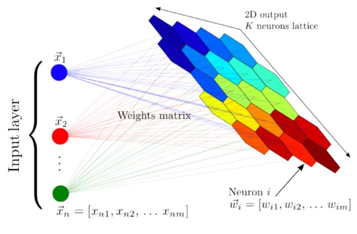 |
Figure 17. A schematic illustration of a self-organizing map, taken from Carrasco Kind & Brunner (2014). The input dataset consists of n objects, each with m features, and it is mapped to a two-dimensional lattice of k neurons. Each neuron is represented by a weight vector, which has the same dimensions as the input objects. The weights are characteristics of the neurons themselves, and they represent the coordinate of each neuron in the input data space. These weights are updated during the training process, and once the algorithm is trained, they represent a set of templates (or prototypes) that describe the different objects in the dataset. |
The training of a self-organizing map is a competitive process, where each neuron in the output layer competes with the other neurons to best represent the input dataset. The first step of self-organizing maps is a random initialization of the weights, where typically, the initial weights are set to be equal to randomly-selected objects from the input dataset. Then, the algorithm iterates over the objects in the input dataset. In each iteration, the algorithm computes the distance between the particular object and all the neurons in the output layer, using the euclidean distance between the object's features and the weight vectors that are associated with the neurons. Then, the algorithm determines the closest neuron to the input object, and updates its weight vector to be somewhat closer to the input object. The algorithm also updates the weight vectors of the neighboring neurons, such that closer neurons are updated more than farther neurons. The update magnitude is determined by a kernel function, usually a Gaussian, which depends on a learning radius parameter. The update magnitude of all the neurons depends on a learning rate parameter, where both the learning radius and the learning rate decrease with time. The self-organizing map converges after a number of iterations, and in its final form it separates the input dataset into groups of similar objects, which are represented by nearby neurons in the output layer. The final weights of the network represent prototypes of the different groups of objects, and they are usually used to manually inspect the dataset. Self-organizing map is implemented in python and is publicly available on github 16.
Self-organizing maps are general and flexible, and their capability of sorting the input dataset onto a two-dimensional plane allows manual inspection of a relatively small number of prototypes, and use these to explore the structure of the dataset. However, in their simpler versions, self-organizing maps cannot be applied to astronomical images, since the algorithm is based on euclidean similarities, which is not invariant to rotations and flips. Polsterer et al. (2016) developed PINK, which is a self-organizing map that is invariant to rotations and flips, which is particularly useful for galaxy images, for example. Figure 18 shows an application of PINK to 200 000 radio images, taken from Polsterer et al. (2016). The left panel shows the resulting two-dimensional map, which contains the derived prototypes. These prototypes allow a clear separation of the input dataset into different morphological types, and by manually inspecting the map, one can explore the range of morphological types in the dataset, without manually inspecting thousands of images. The right panel shows eight outliers, which are objects which are not well-represented by any prototype.
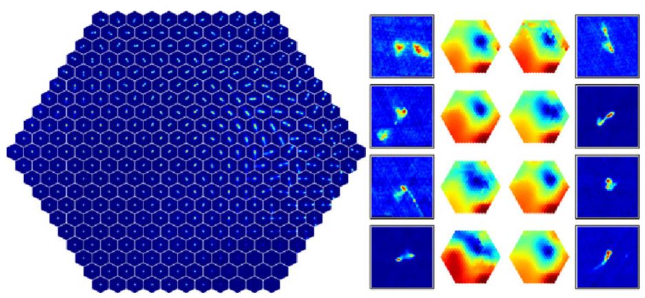 |
Figure 18. Application of PINK to 200 000 radio images from Radio Galaxy Zoo, taken from Polsterer et al. (2016). The left panel shows the resulting two-dimensional map containing the derived prototypes. The right panel shows eight outliers that were selected based on their dissimilarity with the prototypes, and heatmaps that indicate their distance to all the prototypes. |
Outlier detection is the natural step after classification and the analysis of the dataset structure. In Astronomy, outlier detection algorithms were applied to various datasets, including galaxy and stellar spectra, galaxy images, astronomical light-curves such as variable stars, radio images, and more (Meusinger et al. 2012; Protopapas et al. 2006; Fustes et al. 2013; Nun et al. 2016; Agnello 2017; Baron & Poznanski 2017; Solarz et al. 2017; Hocking et al. 2018; Reis et al. 2018a; Segal et al. 2018; Giles & Walkowicz 2019). There are various types of outliers we expect to find in our datasets. Outliers can be objects that were not intended to be in our datasets, such as a quasar in a sample of stars, or various observational or pipeline errors. Such outliers are not scientifically interesting, but we wish to detect them and remove them from our samples. Outliers can be extreme objects drawn from the tail of well-characterized distributions, such as the most massive supermassive black hole or the most luminous supernova. Such objects are interesting because they allow us to test our models, which were built to describe the bulk of the population, in extreme regimes, and by studying them, we can learn more about the bulk of the population. The most interesting types of the outliers are the "unknown unknowns" (Baron & Poznanski 2017), objects we did not know we should be looking for, and may be completely new objects which offer the opportunity to unveil new physics. Furthermore, in Astronomy, outliers can actually be very common phenomena, that occur on time-scales much shorter than other time scales of the system. For example, if every galaxy in the universe becomes green for 100 years, while in the rest of the time it evolves on a time scale of hundereds of million of years with its "regular" blue or red color, the probability of detecting a galaxy in its "green phase" using surveys such as the SDSS is close to zero. Therefore, although this "green phase" occurs in every galaxy and might be a fundamental phase in galaxy evolution, green galaxies will appear as outliers in our datasets.
Unknown unknowns are usually detected serendipitously, when experts visually inspect their datasets, and discover an object that does not follow the accepted paradigm. Manual inspection becomes impractical in the big data era, where surveys provide millions of observations of a particular class of objects. Indeed, the vast majority of observations are no longer inspected by humans. To facilitate new discoveries, we must develop and use off-the-shelf algorithms to perform anomaly detection (see discussion by Norris 2017a, b). Outlier detection is in some sense the ultimate unsupervised learning task, since we cannot define what we are looking for. Therefore, outlier detection algorithms must be as generic as possible, but at the same time they must be optimized to learn the characteristics of the dataset at hand, since outliers are defined as being different, in some sense, from the bulk of the population.
In most supervised and unsupervised tasks, the input dataset either consists of the original astronomical observations (spectra, light-curves, images, etc), or features that were extracted from the original observations, and there are advantages and disadvantages to both of these choices. However, anomaly detection should be carried out on a dataset which is as close as possible to the original dataset, and not on extracted features. First, defining features directly limits the type of outliers one might find. For example, in galaxy spectra, extracted features include the properties of the stellar population, and measurements of different emission lines. Such features will not carry information about new unidentified emission lines in a galaxy, and if such anomalous galaxies exist, they will not be marked as outliers. Second, extracted features are usually an output of some pipeline, which can sometimes fail and extract erroneous feature measurements. Such errors typically occur in outlying objects, since the models that are used to extract the features cannot describe them well. In such cases, the resulting features, which were wrongly measured, typically show values that are consistent with features measured for the bulk of the population, and such outliers cannot be detected (see Baron & Poznanski 2017 for examples).
3.4.1. Anomaly Detection with Supervised Learning
Supervised learning algorithms can be used to detect outliers, in both classification and regression tasks. When applied to new previously unseen objects, most supervised learning algorithms provide some measure of uncertainty or classification probability. Outliers can be defined as objects that have a large classification uncertainty or low classification probability. For example, a Random Forest algorithm is trained to distinguish between the spectra of stars and quasars. Then, it predicts the class (and class probabilities) of previously unseen objects. An object that is classified as a star with a probability of 0.55 (and probability of 0.45 to be a quasar) is probably more anomalous than an object that is classified as a star with a probability of 0.95. Therefore, the anomaly score of the different objects in the sample can be defined according to the classification probability. While easy to interpret, such a process will only reveal the outliers that "shout the loudest". Using again the star-quasar classification example, while a galaxy spectrum will be marked as an outlier by such a procedure, more subtle outliers, such as stars with anomalous metallicity, will not be detected. This is because supervised learning algorithms are optimized to perform classification (or regression), and as such, they will use only the features that are relevant for the classification task at hand. Therefore, objects which show outlier properties in these features will be detected, while objects that show outlier properties in features that are less relevant for the classification task, will not be detected.
3.4.2. Anomaly Detection with Unsupervised Learning
There are several ways to perform outlier detection in an unsupervised setting. First, one can assign pair-wise distances between the objects in the sample, and define outliers as objects that have a large average distance from the rest of the objects (see e.g., Protopapas et al. 2006; Baron & Poznanski 2017). As discussed in section 3.1, in some cases, using a euclidean metric might not result in an optimal performance, and one should consider other metrics. For example, the unsupervised Random Forest-based distance was shown to work particularly well on spectra (Baron & Poznanski 2017; Reis et al. 2018a, b), and cross correlation-based distances work well for time series (Protopapas et al. 2006; Nun et al. 2016).
An additional way to perform outlier detection is by applying dimensionality reduction (which sometimes requires distance assignment as well). Once the high dimensional dataset is embedded onto a low dimensional plane, it can be visualized. Outliers can be defined as objects that are located far from most of the objects or on the edges of the observed distributions. The success of this process strongly depends on the procedure used to perform dimensionality reduction, and one must take into account the internal choices and loss function of the algorithm. For example, when using PCA to project the dataset onto a two-dimensional plane, one must take into account that while some outliers will be objects with extreme values in this 2D projection, and thus will be detected, other outliers can be objects that show extreme values in the other eigenvectors, which are not used for the projection and visualization, and thus will not show up as outliers. Another example is an auto-encoder, where some outliers will show up as extreme objects in the latent space (the two-dimensional representation), while other outliers will show typical values in the latent space, but a large reconstruction error on the decoder side. The final example is tSNE, where one must take into account the fact that the distances of the objects in the two-dimensional projection are not euclidean. In particular, while short distances in the original distance matrix are roughly conserved in the tSNE map, long distances are not.
One of the most popular outlier detection algorithms is one-class SVM (Schölkopf et al. 1999). In one-class SVM, the input data is considered to be composed of a single class, represented by a single label, and the algorithm estimates a distribution that encompasses most of the observations. This is done by estimating a probability distribution function which makes most of the observed data more likely than the rest, and a decision rule that separates these observations by the largest possible margin. This process is similar to the supervised version of SVM, but applied to a dataset with a single label. To optimize over the free parameters of SVM, such as the kernel shape and its parameters, the input dataset is usually divided into a training set and a validation set (there is no need for a test set, since this is an unsupervised setting). The algorithm is trained on the training set, resulting in some decision function, while the free parameters are optimized using the validation set. Therefore, the chosen kernel shape and its free parameters are chosen to give the highest classification accuracy on the validation set, where the classification accuracy is defined by the number of objects that are classified as inliers (the opposite of outliers) by the resulting decision function (see e.g., Solarz et al. 2017). The learned decision function is then used to define outliers. Outliers are objects that are outside the decision function, and their anomaly score can be defined by the distance of the outliers from the decision function.
One-class SVM is feasible only with datasets composed of a handful of features. Therefore, it cannot be directly applied to astronomical observations such as images, light-curves, or spectra, but can be applied to photometry or derived features. One-class SVM is available in the scikit-learn library 17.
Another very popular outlier detection algorithm is Isolation Forest (Liu et al. 2008). Isolation Forest consists of a set of random trees. The process of building such a forest is similar to the training process of Random Forest, but here both the feature and the splitting value are randomly selected at each node. Within each tree, outliers will tend to separate earlier from the rest of the sample. Therefore, the anomaly score can be defined as the depth at which a specific object was split from the rest, averaged over all the trees in the forest. The running time of Isolation Forest is O(N), where N is the number of objects in the sample, and it can be applied to datasets with numerous features. Baron & Poznanski (2017) compared its performance to that of the unsupervised Random Forest-based outlier detection, and found that Isolation Forest is capable of finding the most obvious outliers, those that "shout the loudest", but cannot detect subtle outliers, which are typically more interesting in an astronomical context. On the other hand, Reis et al. (2018a) and Reis et al. (2018b) found that when tuning the range of possible feature values that are randomly selected in each node (i.e., instead of defining the possible range to be between the minimum and maximum feature values, one could define the range to be between the 10th and 90th percentiles), Isolation Forest results in a comparable performance to that of the unsupervised Random Forest. Isolation Forest is available in the scikit-learn library 18.
9 https://github.com/dalya/WeirdestGalaxies Back.
10 https://scikit-learn.org/stable/modules/generated/sklearn.cluster.KMeans.html Back.
11 https://scikit-learn.org/stable/modules/generated/sklearn.cluster.AgglomerativeClustering.html Back.
12
https://github.com/dalya/IAC_Winter_School_2018;
see also:
https://joernhees.de/blog/2015/08/26/scipy-hierarchical-clustering-and-dendrogram-tutorial/
Back.
13 https://scikit-learn.org/stable/modules/generated/sklearn.decomposition.PCA.html Back.
14 https://scikit-learn.org/stable/modules/generated/sklearn.manifold.TSNE.html Back.
15 https://github.com/lmcinnes/umap Back.
16 https://github.com/sevamoo/SOMPY Back.
17 https://scikit-learn.org/stable/modules/generated/sklearn.svm.OneClassSVM.html Back.
18 https://scikit-learn.org/stable/modules/generated/sklearn.ensemble.IsolationForest.html Back.